Russell Brunson – 108 Proven Split Test Winners
Category: Free For Members
!
IMPORTANT
If you want to be able to watch the course or download it you have to be our paid member.
Please, go here and choose your membership.
Special offer
Lifetime Membership discount available
If you have 3 or more products in the cart, you may see an option to buy Lifetime Membership for only $69 during checkout.
Important: Do not add Lifetime Membership to the cart before checkout. The discounted lifetime offer appears later as an upsell offer.
🏆
✅ Stable Website
✅ We Are Not Resellers
✅ Automatic Access
✅ Stream or Download
✅ No Subscription
✅ Working Request System
✅ Great Support
✅ No Partnerships with Other Sites
108 Proven Split Test Winners!
“Simple Tweaks You Can Make To Your Website, So You Can Make More Money Now!”

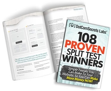
Inside Of This Free Book You’ll Discover The Results To These Shocking Splits Tests:
- We added ONE tiny thing to our blog, and is making us $276 for EVERY thousand visitors we get to our blog… (this one is almost dumb, cause it’s SO easy to add to ANY blog) (Page 9)
- “Buy Now” VS “Free Trial” – one of them will give you a 158.6% increase – do you know which one? (Page 10)
- When do you show your order form – screw this one up and you could lose 44% of your sales (Page 11)
- The secret “Bridge” page you should show BEFORE anyone sees your video sales video – by blocking your orders with this page before they see your message, you can see up to a 59% increase in conversions! (Page 13)
- The unobvious price drop that gave us a HUGE 616.4% INCREASE in conversions and gave us 4 times as many customers! (Page 14)
- What we learned from a recent campaign that added 41,000 new members to one sites in just 30 days (Page 15)
- The mobile responsive squeeze page SCAM… don’t listen to the “gurus’s”.. we did, and it killed our conversions by 83%… (Page 17)
- Where do you put your testimonials? Did you know that the location on the page you place them can actually INCREASE conversions on your VSL by 101% Yes, twice the number of sales without touching the VSL! (Page 18)
- The strange “Mad Libs” style squeeze page that increased conversion by up to 40%! (Page 19)
- We know it’s essential to make your order forms secure, but did you know that making your squeeze pages secure can increase option conversion by 29%? (Page 20)
- Boobs VS Oboma – which one wins? Knowing this could help give you a 45% conversion on your next landing page! (Page 21)
- Animated VS Static headlines… one of them will DROP your conversions by 29% – MAKE SURE YOU DON’T USE THE WRONG ONE. (Page 22)
- Offer this ONE THING for free – and see in INSTANT 55% boost in your sales! It’s so easy you’ll be shocked you missed it before. (Page 24)
- Should you change your offer by traffic source? YES! – Traffic from Facebook that saw this tiny offer tweak increased conversions by a WHOPPING 75.6% – yet it HURT conversions from our other traffic sources. (Page 25)
- The TWO magic words (next to your order button) that increased conversions by 28% (Page 27)
- Selling SAAS products? Should you focus on the length of the trial or the speed of singing up? One of them will increase your conversions by 30% – the other will slow signups to a screeching halt. (Page 27-28)
- How simple is your design? – cutting these 20 items OFF your landing page will increase conversion by 21% (Page 29)
- Oh ya… and did I mention that I actually GIVE you the sales script that we used that took my company from 7 figures a year… to 8 figures a year! (Just give this to any sales person and watch your business EXPLODE!!!) (Page 85-87)
- Red order button or Green order button? Choose carefully because you’re risking 34% increase in conversions! (Page 30)
- The tiny headline tweak that increased conversion by 58% (Page 30-31)
- The strange “Mad Libs” style squeeze page that increased conversion by up to 40%! (Page 19)
- The copy ABOVE your order button could be KILLING your sales – we tweaked two words and saw 39% increase! (Page 31)
- The “Time Continuum Landing Page” technique for COLD TRAFFIC I learned from an underground PPC guy that allowed me to add TWO words to my headline and took a dead PPC campaign and instantly made it HYPER profitable. Understanding this copy hack will get your pages to FINALLY convert to cold traffic! (Page 32)
- Long copy VS Video… we FINALLY have a definite winner, and I think you’ll be a little shocked at the victor! But the 33% lift will make it all worth it. (Page 33-34)
- Check out this 230% boost with a simple headline redesign – same text, different look! (Page 24)
- Doing the “Primacy Effect” on your order forms the WRONG way can DROP your conversions instantly by 72% – making this mistake on your order form is like having a hole that is sucking money out of your pocket. (Page 37)
- A few order button delay tests on VSL… this goes against what EVERY guru has been teaching for 3 years… (Page 38, 49 and 72)
- Adding these 7 things to your light box pop-up increased conversions by 67%! Ignore these at your own peril. (Page 39)
- Do coupons boost sales on Facebook? Or will they actually hurt you? Shocking proof that will change how you market on Facebook. (Page 40)
- A new take on your P.S. that gave us an amazing 63% increase in conversions! Adding this small element can take you just a few minutes, but the effect on your wallet will last a lifetime! (Page 41)
- A widget you can embed on your VSL page that will give you an instant 5% bump without you needing to do anything except copy / paste. (Page 43)
- Is content killing you? We removed 75% of our sales page and increased conversions by 80%. Make sure you aren’t including this on your website or you may be pushing away more people then you are attracting. (Page 44)
- Check out this RADICALLY different (and kinda CREEPY) landing page background that gave one SAAS company a 103% increase in new customers literally overnight! (Page 45-46)
- After being told that this headline tweak would INCREASE conversions, we were shocked to see it dropped our conversion by 16.36%… BEWARE of who you’re getting your testing advice from! (Page 50)
- The “Video Spoiler” box that increase sales on our VSL by an incredible 73%! After we learned this one, we added it to every VSL we had and saw very similar bumps! (Page 62)
- The “Webinar Recap” block that increased our post webinar sales by 119.51% – It increased our revenue per webinar registration from $4.57 to $10.04!- AMAZING considering we didn’t change ANYTHING on the actual webinar! (Page 51)
- That BIG ANNOYING button that raised our conversion by 25%! (Page 52)
- What color is your headline? If it’s matching your site design, it’s probably HURTING your conversions. Change them to this color and see an almost INSTANT 313% increase! (Page 53)
- DON’T SCARE COLD TRAFFIC – taking this OFF of your site will show you a 10% increase to all forms of cold traffic. (Page 54)
- This new “Micro-Commitment” style squeeze page gave us a 95% lift over our old control (which we had tested for years, and assumed was unbeatable) (Page 56)
- Everyone says that “Trust” seals will increase your conversions, but you’d be *shocked* to find out the REAL stats that they don’t want you to know about. This 14% DECREASE will make you a believer. (Page 57)
- The Affiliate Hack you can add to any of your webpage that will get an instant stream of new affiliates to promote your products with out ANY extra effort! (Page 59)
- The Facebook / Order Form Trick – this one took 36 seconds to add to our order form and gave us an 80% increase in sales! (Page 60)
- The “Hot List” pre-frame to take someone to BEFORE they get to your order form that causes MORE buyers NOW! (Page 61)
- Adding the “Calculator Close” above our order buttons gave a quick 8% bump in sales! (Page 62)
- How big is your sales video? Did you know that the dimensions have an IMMEDIATE impact on sales? We made this tweak and saw an instant 31% increase in sales! (Page 63)
- Should you have a pause button on your VSL? Should you do just text, or text plus video? Should I offer split pay? Delayed order button? These 9 tests will show you the PERFECT winning combination! (Page 64)
- Should you delay your order button on upsells? Screw this one up and you will LOSE 188% of the profit you could (and should have made). Despite my best guess, I got this one DEAD wrong. Do you trust your guess? (Page 65)
- We added this option to our OTO page and NO ONE took it, but when we took it away our sales DROPPED by 15%. Learn how you can add this Decoy to your OTO page and instant increase your sales! (Page 66)
- This test was very controversial and went AGAINST what a few top Guru’s have been preaching when it comes to Facebook Connect. We tested the OPPOSITE of what everyone was saying, and I was SO glad we did – because we saw a 65% INCREASE in optins when we broke “their” rules. (Page 67)
- One small thing we added to our automated webinar registration pages that pulled out our buyers FAST and had them purchasing BEFORE most people ever saw the webinar… (Page 68)
- We added this “Testimonial Graffiti” to the white areas on our order form and saw a 44% increase in sales! (Page 69)
- The payment options trick that gave one of our readers a 217% INCREASE in sales! (Page 71)
- ONE word on our squeeze page that increased optins by 206% (page 73)
- Changing ONE number in our headline gave us a quick 34% bump.) (Page 74)
- One of these webinar registration pages INCREASED our conversions by 29.45%. Can you guess which one? (it’ll probably make you angry at first, and then happy later because you’ll be able to fire your designer!) (Page 55)
- A new order form tweak that increased sales by 76% (Page 76-77)
- Should you do a 7 day trial or a 30 day trial? One of them will give you a 110% increase – can you guess which one? (Page 78)
- All free trials are NOT equal… Should you require a credit card or not? One option resulted in 50% MORE paid customers. (Page 79)
- One slide I added to my webinar that gave me a 25% INCREASE in sales (You can put this into ANY presentation and see similar results). (Page 81)
- The PayPal trick we use on our webinars that instantly put 35% more money into our pockets! (Page 82)
- The tiny “Offer Tweak” that gave one of our friends a 109% INCREASE in sales! (Page 83)
- Are your customers afraid to buy online? Add this to your site and get 65% of those people to buy INSTANTLY! (Page 84-85)
- The secret “Toilet Letter” that increased our LIFETIME Customer Value from $150 to $450 – (I’ll actually GIVE YOU THE LETTER we used! Just tweak it for whatever you sell and watch the money pour in!) (Page 88-93)
- How to make your affiliate links go VIRAL on Facebook! This trick took us from $300 a month to $6,500 a month one one niche site as soon as we implemented it! (Page 95)
- This simple tweak to your ad frequency caps can increase conversion by 68% (at least it did for us – it’s actually done better for many of our readers). (Page 97)
- The secret “Twitter CTA” that will increase your follower rate by a shocking 27%! (Page 98)
- Newsfeed VS Sidebar ads… you’ve heard the rumors, now see our results. (Page 99-100)
- My 3 postcard SMACKDOWN (ya, we’re doing a lot of direct mail now and learning some crazy stuff) (Page 104)
- Postcards VS Tearsheets – two markets tested and a new champion was crowned! See the actual winner inside! (Page 101-106)
- Blatant Pitch VS Curiosity – I’m guessing that you think you know the winner of this one, but I bet you’re wrong! 119% increase if you choose correctly (so choose wisely!) (Page 103)
- My “Dirty Little Conversion” secret that increased click through rates by 122%! This one works in EVERY market I’ve ever tested it in! (Page 115)
- Tiny little classified ads that create HUGE cash. Check out this split test we ran in the Thrifty Nickel. One add received 10X as many sales as the others! (Page 116)
- Adding this in your emails will actually get 20% MORE people to unsubscribe (yet you’re probably doing it now) – fix it ASAP or your list will die! (Page 117)
- The email “Subject Line Trick” that increased opens, click through rates, optins and sales! It’s SO simple, yet NO ONE is doing it. PLEASE COPY THIS ONE! It will make you RICH! (Page 121)
- Make this ONE tweak to the “From” line in your emails and see an instant 8% increase in opens and 32% increase in click through rates! (Page 130)
- Discover our “Control” – the exact layout we START with each of our offers. If NOTHING else, just copy this layout, and 90% of the work will be done. You can then increase your conversions from there! (Page 131-134)
- The 2 words I added to my automated webinar that increased sales by 74.61% (yup, almost doubled sales.. you can also add this to any VSL and get the same results) (Page 136-141)
Related products
Free For Members
Free For Members
Free For Members
Free For Members
Free For Members
Free For Members
Free For Members
Free For Members

